
Overview
Reading habits are transforming.
There is a growing preference for audiobooks and genres like fantasy, young adult fiction, and self-help. While traditional print reading is becoming less common, nonfiction remains popular among consistent readers. This shift reflect an evolution in how people engage with books, driven by changing technologies and lifestyles, highlighting opportunities to innovate and meet diverse reader needs.
ReadAlert seeks to address the growing concern that people, especially working adults, are reading less and less for pleasure. The project's goal was to help users increase reading time through intentional, user-centered design principles.
Background
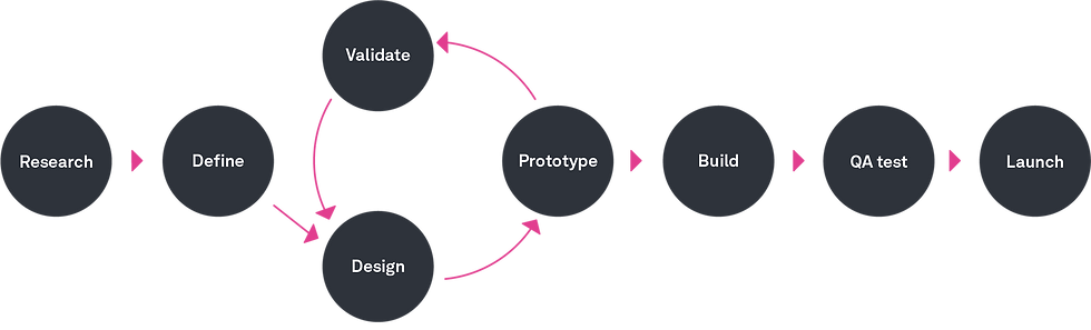
Design Process
As the UX Designer, I prioritized research, validation, and iterating critical flows, delivering a final prototype. I kept user needs central, separating personal interests from user input. Due to this passion project's exploratory nature, time was limited for further prototyping and launch steps.
Through Their Eyes: Understanding the Reader's Challenges
4 out of 5
Participants fondly recalled reading fiction for fun in their younger years but noticed their reading habits shifted when busier lifestyles left little room for an imaginative escape.
Position / Role
4 out of 5
Participants read as a way to pass time at work, as a mental exercise, or a source of curiosity and inspiration -- especially when phones are restricted. It's not something they do when facing stress or urgent tasks.
Position / Role
3 out of 5
Participants noted a decline in reading after higher education, newly favoring memoirs and informational books for vocabulary. 4/5 cited benefits. This presents an opportunity for a native app to address these evolving needs.
Position / Role
To gain a better understanding of different types of readers (focused on previous and current consistent readers), I conducted 5 user interviews with an estimation of the target audience and came across a few commonalities, even though my conversations were with readers along a spectrum of interest in reading frequently.
Readers seek immersive and accessible reading experiences that engage their minds on multiple levels.
Product Benchmarking Reader Resources
By conducting a product benchmark, I accomplished a greater understanding of the digital environment many consistent readers are operating in. Combined with user interviews, I identified opportunities in the market to grow engagement for various levels of readers.

Cumulative Insights on User Reading Habits
Creating a user persona for this UX/UI process highlighted the challenge of readers balancing their passion for books with their busy lives. Product benchmarking and interviews revealed users rely on reading for stress relief and growth but struggle with consistency.
Grounded in these insights, the persona guided solutions to ease these pain points and create an app that truly resonates.
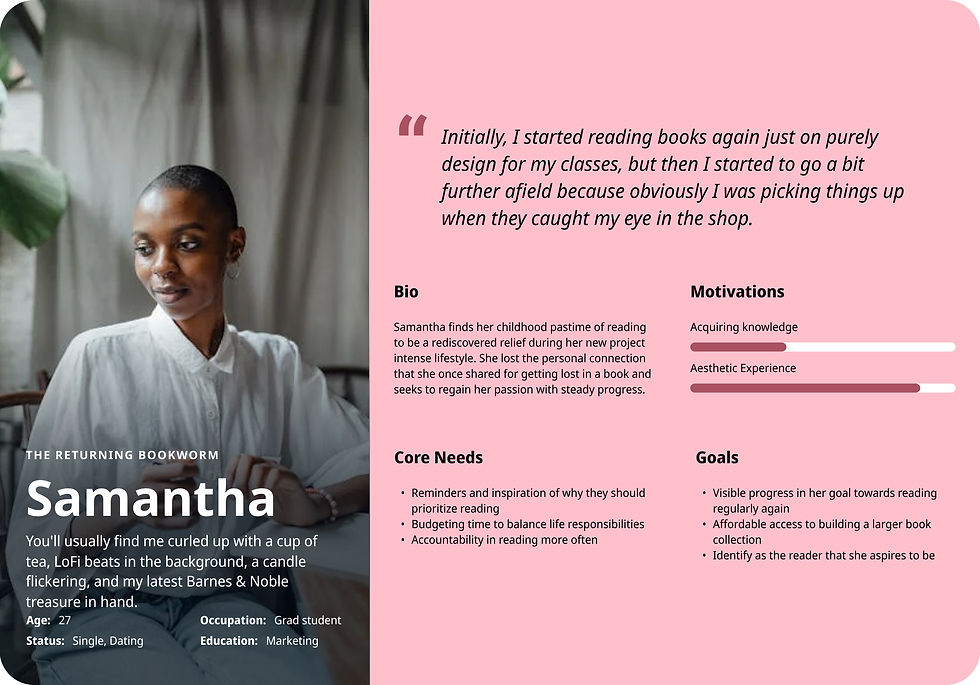
Insights from six interviews shaped the ReadAlert persona, ensuring the app design tackled real reading habits and challenges of readers instead of assumptions.
Novel Soultions for Readers
HMW 1
How might we help readers seamlessly integrate rewarding reading moments into their daily routines, making it effortless and enjoyable?
HMW 2
How might we help readers capture and revisit meaningful quotes and ideas from non-fiction books?
HMW 3
How might we provide accessible, high-quality books that inspire connection and align with a reader's changing interests and passions?
Research revealed that users often felt overwhelmed by lengthy, time-consuming expectations and rigid reading goals. Many expressed they value a more flexible, personalized approach that's able to grow with them.
This realization led to testing the impact of reading check-ins (offering habit-building guidance and input via a reading generator that relied on selected preferences). By reframing the user's view of access to appealing reading opportunities, I hypothesized that the user might achieve a feeling of accomplishment, spark encouragement, and increase motivation.
Relevant 'Point of View Statement': Adults who once regularly engaged in leisure reading but now struggle to find time for it due to work demands need help prioritizing and incorporating it into their schedules because they are frustrated by how easily it gets overlooked and recognize the mental health benefits it provides in relieving stress.
Relevant HMW: How do we help adult readers identify the numeric opportunities in their day to read for personal reasons?

This user flow evolved into a wireflow, a lot of the reading plan flow was an easy transition into how to frame the personalization of the onboarding experience.
Cumulative Insights on User Reading Habits
This user flow outlines two key pathways: joining public reading plans to foster connection and discovery, or creating personalized weekly plans tailored for busy lifestyles. Rooted in user insights, it streamlines the journey from sign-up to a personalized reading experience, addressing common challenges like time constraints and prioritization.
Key points of engagment?
Task Flow #1: Shows how users quickly add text-to-speech options to make content more accessible and engaging.
Takeaway: Sketching key screens revealed these flows weren’t the best focus, as they strayed from the main goal—getting a book into the reader’s hands.

Low-fidelity sketches revealed that the home page needed to balance motivation with easy access, prioritizing a seamless path to the user’s book. Digital wireframes showed the importance of onboarding and daily suggestions to help users set preferences and feel supported, validating the pivot away from settings.
Takeaway: The app needed to guide users in achieving reading goals confidently and provide clear acknowledgment for book completion.
This led to questions about how to communicate progress, allow next steps, and ensure a satisfying experience.
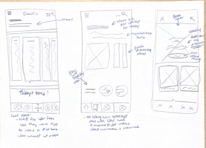
Structuring the ideal reading Experience
Sketches for home layout and key personalization features
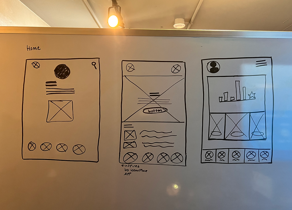
Home layouts & navigation
Sketching ideas from discussions in user interviews as well as design patterns familiar to e-book and apps focused on short form content. The home page content relied heavily on what the main 'Jobs to Be Done' might be. I explored different navigation bars, CTAs, and explore suggestion layouts at this point and during later stages of the low-fidelity wireframing.

Content Engagement Ideation
Exploration of content engagement was a way to visualize how to give users the option to choose or be drawn to generated content. I used references to interview findings to accomplish this. How might the reading content change with front-end settings that adjust the experience? What is the ideal hierarchy and text-to-function ratio when engaging with reading content? Insights proved that this is critical to use.
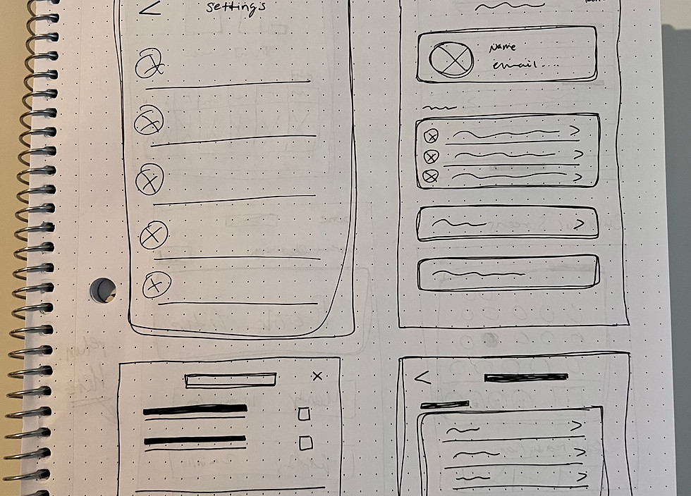
Initial Settings Layout Exploration
Initially, settings needed to be explored as a way to compliment the generation of books for the user to avoid decision fatigue. Relying on default settings or user engagement alone wouldn't effectively address personalization needs in a brand-new app. Exploring how to incorporate user preferences early on helped ensure that the app would meet individual needs from the start. But, I later discovered a faster and more effective way to accomplish this goal for the user.
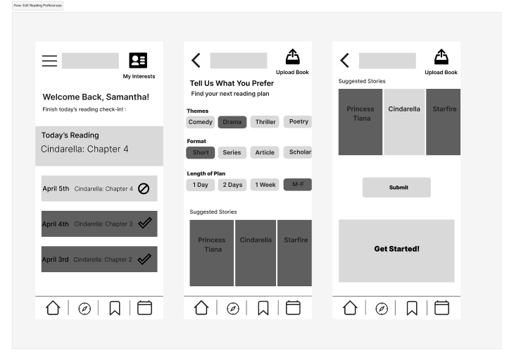
Homepage Content Progression
Wireframe 1 (L) shows a cozy, bookstore-like layout with welcoming text, a row of books, and a sneak peek of what's up next, creating that excitement and avoiding the feeling of being stuck on one book. Wireframe 2 (Center) gives users a list of today's options with a motivational message, a queue of other books, and a thumbs-up/down rating to help the algorithm learn what they like. It also lets them reflect a bit to stay engaged. Wireframe 3 (R) highlights a book cover with a short blurb explaining why it’s a good fit, and a bright CTA to jump into reading, plus two other related book suggestions.
Deciding how to personalize the user experience was a challenge. Through this part of the process, feedback on interaction design and content strategy revealed that relying on settings or reading challenge engagement (though they encourage engagement) was not the most important feature focus for a brand-new app. Instead, onboarding became a focus, it offered a more immediate way to engage users.
Testing Medium Fidelity Wireframes
Onboarding and Content Engagement: Pt. 1 & 2 of Usability Testing

Pivoting from settings as a customization tool, the format remained effective for onboarding.
Mentions of DuoLingo and market leader 'nudges' proved gamification's value for user engagement.
Early-stage exploration of book motivation untethered from restrictive progress tracking and rigid goals.
Audio integration earned positive feedback, but challenges arose from insufficient information.
Decision: Shelf audio integration since there was not enough user need to explore.

To get into the minds of the different types of readers (focusing on previous and current consistent readers), I conducted 6 user interviews with the estimated target audience and came across a few commonalities, even though my conversations were with readers along a spectrum of interest and reading frequencies.
I iterated based on feedback in low and medium-fidelity stages. Testing onboarding was key to validating a hypothesis that readers feel best represented when they set preferences during sign-up. This approach proved to be intuitive and aligned with familiar design patterns, versus expecting users to update settings for a central feature.
The decision to provide versatile content proved to be successful since this showed me that readers seek immersive and accessible reading experiences that engage their minds on multiple levels.
Develop
Testing High Fidelity Wireframes
Onboarding and Content Engagement Concept Validation
Crafting the Book Discovery Experience
Experience the ReadAlert Prototype
The ReadAlert prototype offers a personalized reading experience, where users set preferences and goals during onboarding. Gentle notifications nudge users to stay on track, while features like progress meters and tailored recommendations keep them motivated and engaged.


Next Steps
What began as a simple idea grew into a deeper understanding of what readers value: simplicity, personalization, and a design that adapts to them. Balancing enough options to empower users without overwhelming them became key, showing me that great user experience is all about staying flexible and refining along the way.
If I had more time, I’d dive into testing a success screen and progress indicator after users click “Mark as Read,” just to see how much that little boost of motivation could really make them feel accomplished. I’d also love to make the book recommendations feel more credible by adding author bios, ratings, and descriptions -- things that could help users feel more confident in their choices. It’d be fascinating to interview a wider range of avid readers, too, to make sure we’re capturing all kinds of reading habits.
Overall, 100% (5/5) of participants said they would return to the app, with only one indicating a lowered likelihood (shifting the odds from 5/5 to 3/5) due to the inability to revisit interrupted books on the homepage.
Deliver
High Fidelity Prototype Usability Test Results
HMW 1
Usability ratings were high (4-5/5), with users finding the UI easy and straightforward.
HMW 2
60% (3/5 participants) requested more personalization options during onboarding.
HMW 3
100% (5/5 participants) experienced confusion about progress tracking on the homepage, particularly for ongoing books.
HMW 3
40% (2/5 participants) were unsure about the icons' meanings and wanted clearer visuals.
Users needed this app to feature congratulatory symbols or words to boost users' morale, indirectly encouraging progress and goal achievement. The challenge was deciding whether to highlight goals or content first, which depended on user preferences: some may seek motivation through progress tracking, while others may prioritize immediate access to content. Testing would reveal which approach best served the target audience’s needs and engagement.

Simple Access
At this stage, I decided to simplify the product to focus solely on reminding users to read and making it easy for them to do so. I revisited the persona and affinity map to clarify the core values and ensure alignment with user needs. The primary goal is to provide reading material without distracting users with additional tasks, like reading challenges or goals. The brand language centers around the user's intended purpose when engaging with the app -- making reading effortless and enjoyable.
For the visual design, I selected a balance of neutral tones for calmness, complemented by vibrant accents to inspire energy and action. This combination supports both fun and motivation.

Onboarding & Personalization
Enhancing onboarding, notifications, and goal tracking for a seamless user experience
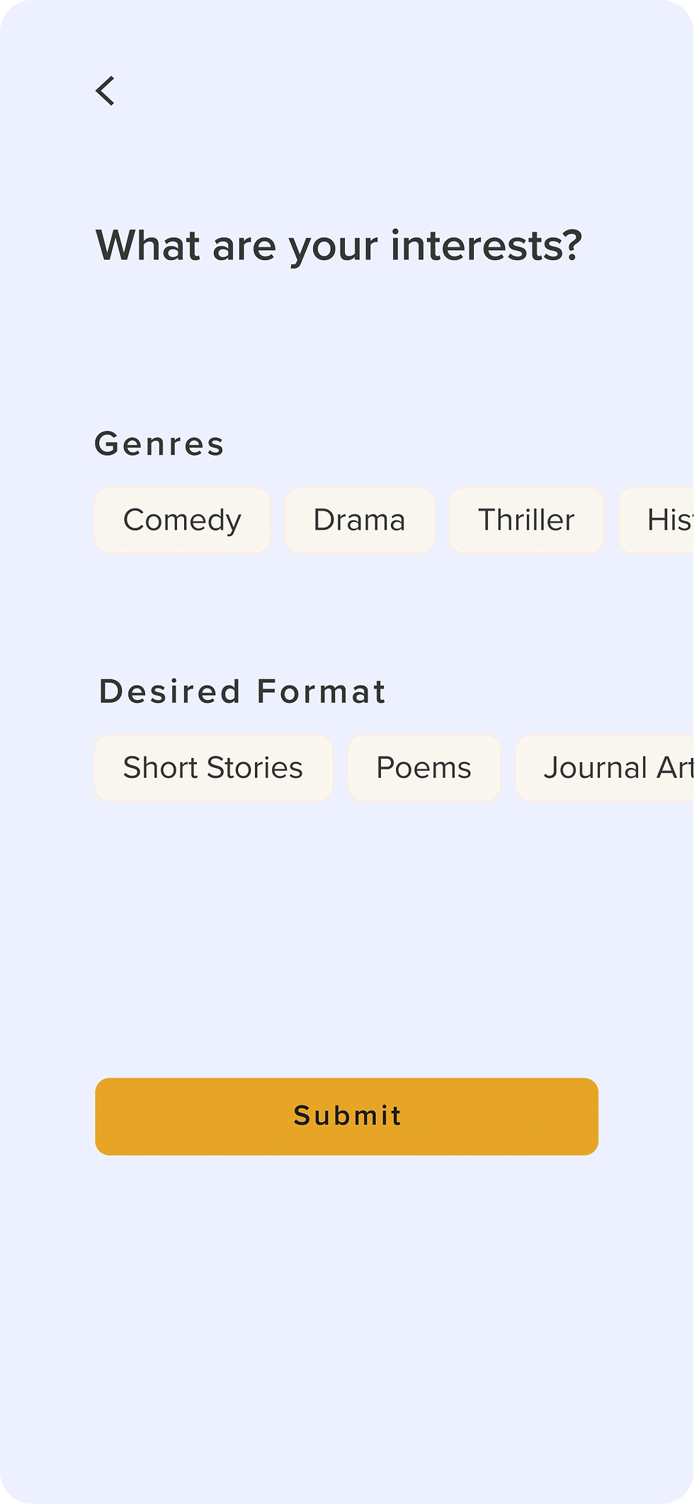
Initially, I thought collecting user preferences through the settings would be the most effective approach. However, I discovered that gathering preferences upfront during onboarding significantly boosted engagement. By asking users to select their favorite reading genres and set their reading goals before accessing content, the app now delivers a more personalized experience that makes users feel “heard” right from the start.
Home Page to Personalization
.png)
Settings. What would exist here?
.png)
Home Page to Reading Content
Notifications
Designing subtle notifications that motivate users without overwhelming them
A key design challenge was finding the right balance to nudge users without overwhelming them. After exploring various approaches, I settled on a non-intrusive notification design that offered a soft reminder to resume reading. Through testing, I discovered that a gentle nudge -- paired with the flexibility to engage later -- struck the perfect balance, keeping users motivated without feeling pressured.
Final Iterations of High Fidelity Screens
Implementing Change to Build User Experience

Role
UI/UX Designer, Researcher, & Content Strategist
Timeline
Jan - May 2024
4.5 months
Project Type
Personal Project • Native App Concept
Skills
Interaction Design
Content Strategy
UI Design
Prototyping
Personalization Options
60% (3/5 participants) wanted more personalization questions to tailor the app experience to their preferences (e.g., favorite genres, authors).
Selection Clarity
40% (2/5) of participants struggled with the wording and format of the selection options, leading to confusion during onboarding.

Feature Change
Added additional personalization options, like asking for favorite genres or authors, to improve user engagement.
Item Five
Reworded selection prompts and simplify the format for better clarity.
Solution
Challenge #2
Background
Reading Habits Are Transforming
Reading habits are changing with audiobooks and genres like fantasy and memoirs rising. ReadAlert helps busy adults rediscover the joy of reading through user-centered design, making books a meaningful part of modern life.
Problem
Former readers love books but abandon the habit due to busy lives and required reading that kills joy. They want to read but feel stuck between life’s demands and the pressure of obligation.
Solution
Bring back the joy of diving into stories despite busy lives by:
-
Creating an engaging, flexible, and motivating reading app.
-
Nudging users to read regularly, meet personal goals, and feel proud of their progress."
Impact
All 5 users (100% of particiapnts) rated the app 4-5/5, praising genre preferences, personalized recommendations, and onboarding for making them feel 'heard'. They also liked its visually appealing design and balance of simplicity and customization.
Navigation Hesitancy
40% (2/5 participants) were unsure of how to navigate through pages (e.g., swipe direction or where to tap to turn pages), leading to frustration during reading.


Feature Change
Implemented intuitive swipe gestures or clearly marked directional buttons (e.g., left/right arrows) for page navigation.
Solution
Challenge #3
Results of Testing: Reader Reviews

Arrow E.
Because I've been reading a lot, I would love going back and logging in my progress or setting goals. This would be a strong 5 out of 5 for me.

Katy A.
Everything goes smoothly and it serves a purpose ... it's pleasing to the eye.

Nora E.
I really like the font. Something that sometimes [digital] books have an issue with [...] just too vibrant or it's extremely hard to read. In [this] case, the process of reading is very intuitive.

Rew C.
I’m always saying to myself [I need to read 20 minutes of this book], but there’s nothing there saying ‘don’t forget'. Half the time [my reminders aren’t enough], and I forget to read that day.

Final Screens (breakdown below)!
Five separate rounds of usability testing with a mockup were conducted with individuals who either read regularly or aspire to do so. In the usability test, users were guided through three key flows: completing the onboarding process to share their reading preferences, navigating to a personalized reading assignment via a notification alert, and checking their progress toward achieving their daily reading goal with a touch of ✨imagination✨.
These tasks clarified the following questions: Do users find the alert notification intuitive for starting their short story, feel the screens meet their expectations without lacking content, and believe the onboarding process (with editable preferences) helps them create content they enjoy?
Tested Screens
Solutions
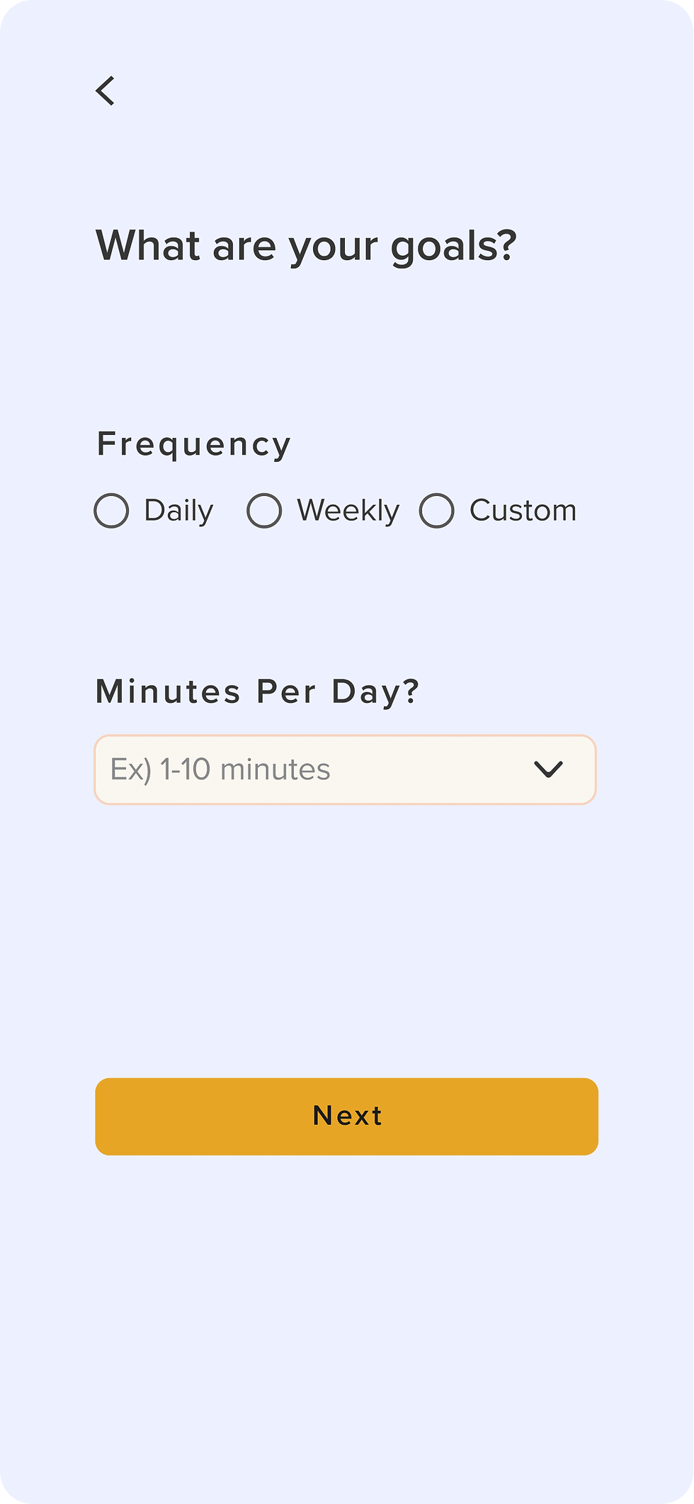
Unclear Onboarding Headers
Problem: 40% (2/5 participants) found headers like “What are your goals?” and “Frequency” vague and unclear, leading to user uncertainty about what was being asked.
Feature Change
Intentionally clarifiying headers to reflect their specific context (e.g., “What are your reading goals?” and “What is a good time for you to read each day?
