Role
UI/UX Designer, User Researcher, Content Strategy, & Project Management
Timeline
November 2024
(5 Weeks)
Project Type
Contract
End-to-End Mobile App
Skills
User Interviewing
Content Strategy
UI Design
Prototyping
Background
The average theater student's access to adequate education is limited.
Today’s aspiring students and professionals face numerous challenges navigating their educational and career pathways. Many existing platforms fall short of providing a streamlined and personalized experience, leaving users frustrated and unmotivated.
Problem
Theater students and aspiring professionals often cite difficulty finding relevant resources, lack of tailored guidance, and confusing navigation as major obstacles. The fragmented user experience was not only impeding goal achievement but also diminishing user engagement and retention.

Solution
Through user research and iterative design, we developed a platform that simplifies career and educational planning, providing users with tailored recommendations, intuitive navigation, and streamlined workflows. The final design featured a user-friendly interface informed by quick access to feedback, ensuring the solution was not only functional but also delightful to use.
Impact
Users were impressed by the platform’s intuitive design and engaging gamification. Stakeholders praised the app's feature and the impressively streamlined alignment of business and user needs, leading to a highly impactful Minimum Viable Product ready for development in the coming months.
Background
Overview
Access to theater education remains uneven and full of barriers.
Aspiring students and professionals face countless hurdles in pursuing their passions, often left frustrated by platforms that fail to deliver the streamlined, personalized experiences they need. Struggling with clunky navigation, irrelevant resources, and a lack of guidance, their goals can feel just out of reach.
Through in-depth user research and bold, iterative design, we reimagined the process, crafting a platform that empowers users with intuitive navigation, tailored recommendations, and seamless workflows -- transforming frustration into delight and paving the way for growth and success.
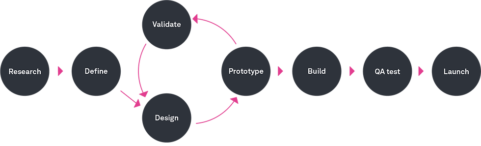
Design Process
In this 5-week project, I collaborated in leading the design of a learning management platform. Using an agile process, we managed the design journey -- from user research to prototyping -- while collaborating with stakeholders and a design team to ensure the platform aligned with user needs and objectives.
Research
Listening to the Voices That Matter Most
4 out of 5
(60%) of participants identified financial and time constraints as major deterrents, yet 3 out of 5 (80%) cited community and personal growth as key motivators for their involvement in theater.
4 out of 5
(80%) of students reported a lack of affordable, high-quality training resources, with 80% also expressing difficulty in accessing individualized feedback and mentorship due to costs or limited availability.
5 out of 5
(100%) of participants struggle to organize audition materials and retain feedback, highlighting a clear need for a streamlined digital toolkit to enhance preparation and improve time management.
Our user research began with in-depth interviews with five participants, ranging from hobbyists to professionals, combined with regular stakeholder meetings to align on business goals and research outcomes. This approach helped us gain a clear understanding of theater enthusiasts’ career-building needs, uncovering their motivations, behaviors, and pain points. These insights from affinity mapping outcomes shaped key design assets, ensuring our decisions were grounded in the users' aspirations:


Testing Medium Fidelity Wireframes
Onboarding and Content Planning
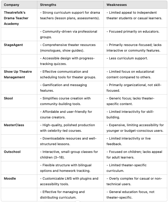
Competitor Strengths
-
Theater platforms excel at building strong communities.
-
Provide tailored resources such as lesson plans, show guides, and monologue databases.
-
Gamification and live session capabilities foster user engagement and learning.
-
Highlight the value of customizable tools for flexibiliy.
-
Deliver polished, professional-grade educational content.
-
Mobile integration enhances accessibility.
Competitor Weaknesses
-
Too much focus on specific audiences, leaving gaps for casual learners or hybrid roles.
-
Lack of strong collaboration tools for group projects or networking across experience levels.
-
Premium content exclude budget-conscious users.
-
Overwhelm casual users with complex setups.
-
Fail to combine comprehensive theater resources with highly interactive, role-focused features.
The Inside Scoop
We interviewed four participants, ranging from hobbyists to professionals, alongside gathering stakeholder feedback, to understand theater enthusiasts’ career-building needs. Participants completed four tasks -- creating an account, viewing challenges, enrolling in a course, and posting to the community hub.
Medium-fidelity prototypes were tested to validate core functionalities, uncovering usability issues that were refined in high-fidelity testing. For example, navigation menu placement was adjusted by adding a persistent sidebar. An A/B testing round was completed to inform design direction. This iterative process ensured the final design effectively met user needs.
I synthesized user interview findings using affinity mapping and presented key insights, along with 'How Might We' and POV statements, to the stakeholders. This helped align the team by turning user challenges and business goals into actionable feedback, narrowing our focus and overcoming initial conceptualization obstacles. The collaborative session unified our direction, ensuring the project stayed on track.
Most Relevant 'Problem Statement':
An aspiring student needs a way to find personalized resources and actionable guidance because existing platforms overwhelm them with irrelevant information.
Most Relevant 'How Might We' Statements:
-
How might we simplify the process of finding relevant resources?
-
How might we create an interface that feels intuitive and supportive?
-
How might we ensure the platform adapts to diverse user needs?
Define

Turning Insights into Action: Crafting a Personalized, Intuitive Experience
Task flows revealed where users encountered roadblocks, such as redundant steps or unclear navigation paths. In response, user flows were designed to create a cohesive journey, emphasizing clarity and ease. Analyzing user workflows, we identified critical tasks such as "searching for resources" and "tracking progress" that needed simplification. For instance, our user flow illustrated a direct route from logging in to accessing tailored recommendations, bypassing unnecessary steps. Affinity mapping further helped organize user insights into actionable design priorities, aligning them with the platform’s core objectives.

Cumulative Insights on User Reading Habits
This user flow outlines two key pathways: joining public reading plans to foster connection and discovery, or creating personalized weekly plans tailored for busy lifestyles. Rooted in user insights, it streamlines the journey from sign-up to a personalized reading experience, addressing common challenges like time constraints and prioritization.
From Feedback to Final Design: Refining the Experience
To ensure our high-fidelity designs hit the mark, we interviewed three more participants -- still spanning hobbyists to professionals -- and held a quick stakeholder check-in to confirm we were on the right track. After enthusiastic feedback from stakeholders, participants successfully tackled the same four tasks as before -- creating an account, exploring challenges, enrolling in a course, and posting to the community hub.
Key Flow #1: Create an Account + Onboarding Questions
-
On a scale of 1-10, how would you rate the difficulty of this task?
-
Were there any points of confusion during the onboarding process?
-
Do you have any suggestions for improvement for this task?
Key Flow #2: User View and/or Complete their Daily Challenge Questions
-
On a scale of 1-10, how would you rate the difficulty of this task?
-
Are there any suggestions you have to improve this process?
-
What did you enjoy about the process?
-
How likely are you to participate in a daily challenge?
-
Would you prefer a variety of options (quotes, quick trivia, etc)?
Key Flow #3: User Enroll in Course + Checkout Questions
-
Was any step confusing or unclear?
-
Did you run into anything unexpected?
-
Any other feedback regarding the visual design or ways to make this task more clear?
Key Flow #4: User Post to the Community Hub (Video/File Submission) Questions
-
Is there anything you expected to have as an aid to completing this task that was unavailable?
-
On a scale of 1-10, how digestible was this process?
-
What would you like to see as an improvement?
-
What did you enjoy about the process?
-
How likely would you be to utilize this route for feedback? Why or why not?
-
Any technical points of friction or confusion?
-
Any additional suggestions?
-
-
Moderated testing via Zoom (30-45 minutes)
-
Data synthesizing and shared transcripts analyzed overlaps in findings
-
Scope: 2 days of research to move forward in timeline as soon as possible
-
4 participants; hobbyist, theater adjacent hobbyist, professional, aspiring professional
-
Stakeholder meeting for feedback on design direction (Weekly)
-
Task #1: Create an Account + Onboarding
-
Users felt onboarding could be shortened for ease of process
-
One user kept accidentally skipping questions from onboarding
-
Overall users felt the process was fairly simple and straightforward
-
Difficulty level average: 2/10
Task #2: User View and/or Complete their Daily Challenge
-
Users enjoyed learning a new fact
-
Appreciated having a short description explaining the answer
-
Questioned why video did not play, highlighting value of feature predictability
-
Participants felt they would interact on occasion with the daily challenge
-
Difficulty level average 2/10
Task #3: Enrolling in a Course-
Some users were unsure about the answers for questions being asked (not all had theater education)
-
Felt process could be shortened in the amount of questions asked
-
Difficulty level average: 3/10
Task #4: User Post to the Community Hub (Video/File Submission)-
Some users were confused by “Grow” on navigation assumed it would be “Learn”
-
Once they got on page, they were able to enroll in the course fairly quickly
-
Difficulty level average: 3/10
-
Theater Student Notes: Revising Our Initial Solutions
Onboarding
Easy to complete, but some questions (e.g., city/state, theater dates) felt irrelevant. Lacked clarity on user experience levels and union memberships.
Daily Challenge
Engaging but unclear when videos were complete. Users wanted the ability to revisit videos and questions.
Course Enrollment
Straightforward, but users questioned the low price and wanted clarity on teacher interaction or course community features.
Community Hub
Some questions felt redundant or unnecessary. Upload prompts lacked focus and clarity.
To gain a better understanding of different types of readers (focused on previous and current consistent readers), I conducted 5 user interviews with an estimation of the target audience and came across a few commonalities, even though my conversations were with readers along a spectrum of interest in reading frequently.
Readers seek immersive and accessible reading experiences that engage their minds on multiple levels.

Wireframes illustrating the core tasks: account creation, challenge viewing, course enrollment, and community posting.
Iterative Outcomes: Feature enhancements
Streamlined Onboarding & Profile Customization
Simplified sign-up by deferring optional tasks and adding clearer progress indicators, better button placement, and fewer questions.
Improved Content Hierarchy & Navigation
Renamed "Grow" to "Learn" for clarity and reorganized layouts to highlight badges, challenges, and notifications.
Enhanced Community & Professional Features
Kept the Community Hub separate for peer discussions and added distinct flows for professional and peer feedback with real-time availability.
Optimized Features & Visual Feedback
Added progress indicators, replay functionality, payment confirmations, and streamlined file submissions for pre-recorded clips.


Profile Customization
Revised the hierarchy of profile customization to prioritize the most critical elements, ensuring users focus on the features that enhance engagement and personalization.
Improved Content Hierarchy & Navigation
Renamed "Grow" to "Learn" for clarity and reorganized layouts highlighting badges, challenges, and notifications.
Streamlined Onboarding & Profile Customization
Simplified sign-up by deferring optional tasks and adding clearer progress indicators, better button placement, and fewer questions.
Develop
A comprehensive UI kit was developed to ensure visual consistency and scalability. It included typography, color palettes, iconography, and component libraries, serving as a valuable resource for the development team and future updates. By providing clear guidelines, the UI kit streamlined collaboration and ensured a cohesive user experience.
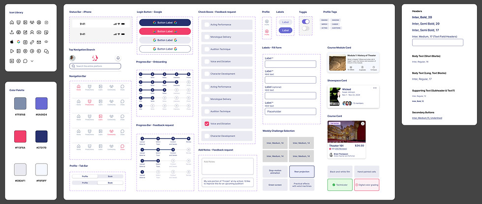
Consistency: Transforming an Incomplete UI Kit
One of our key challenges was transforming a minimal UI kit, originally Android-based (along with a set of limited desktop elements), into a modern and iOS-centric brand style tile and UI Kit. It was important to provide visual consistency and scalability.
Testing High Fidelity Wireframes
Onboarding and Content Calibration
Deliver

High Fidelity wireframes illustrating the outcome of core design iterations.
Streamlined Onboarding & Profile Customization
Simplified sign-up by deferring optional tasks and adding clearer progress indicators, better button placement, and fewer questions.
Improved Content Hierarchy & Navigation
Renamed "Grow" to "Learn" for clarity and reorganized layouts to highlight badges, challenges, and notifications.
Enhanced Community & Professional Features
Kept the Community Hub separate for peer discussions and added distinct flows for professional and peer feedback with real-time availability.
Optimized Features & Visual Feedback
Added progress indicators, replay functionality, payment confirmations, and streamlined file submissions for pre-recorded clips.
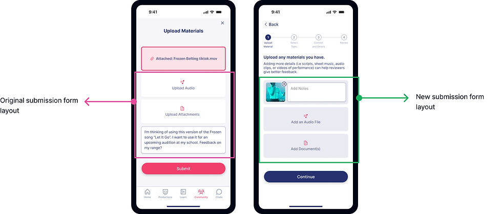
Solution 05
Revised the submission flow to prioritize key elements, allowing users to review, edit, and confirm their files before submission, and leave with confirmation of successful delivery!
Solution 04
To enhance recognition and consistency, the onboarding progress indicator was integrated into this section, improving guidance and maintaining UI uniformity.

Solution 03
After reflecting on the client’s vision and long-term user relationships, we added detailed professional profiles to showcase credibility. This enables users to connect directly for personalized advice rather than relying solely on general requests.

Solution 02
Simplified the feedback request process to eliminate friction within the community hub. Improved sorting and filtering hierarchy to help students quickly find and prioritize their tasks based on likely use cases.

Solution 01
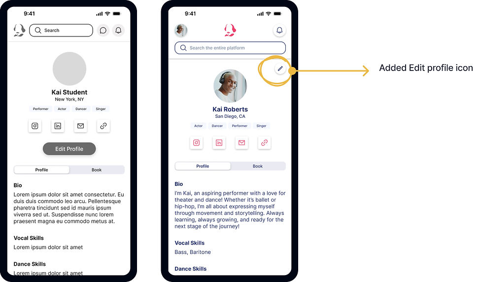
To clearly differentiate students from professionals, a profile pop-out menu was designed for better organization and visual distinction. Enhanced visual cues now improve separation, while task indicators and progress tracking integrate gamification elements, aligning with stakeholder feedback.

Final Iterations of High Fidelity Screens
Implementing Change into the Final User Experience

Co-Founder of Actor's Pocket Guide: Anatole N.
"Jenica excels in maintaining sharp attention to detail while never losing sight of the core objectives, ensuring every aspect of their work aligns with the project's goals. Jenica's unwavering focus and precision set them apart, consistently delivering results of the highest quality."
"It was such a pleasure to work with Matt, Jenica, and Zaira on this project. They demonstrated incredible creativity, teamwork, and dedication, producing a design that is both innovative and visually stunning. Their ability to seamlessly collaborate and incorporate diverse perspectives into their work has been truly impressive. The final product reflects their hard work, attention to detail, and commitment to excellence, setting a high standard for others to follow."
Next Steps
What I Learned: This project highlighted the importance of finding ways to incorporate and involve some form of user input at several stages. User interviews provided a foundation for usability testing, pricelessly impacting the trajectory of design decisions being informed by real-world needs. My team was able to learn lessons helpful for designing for Actor's Pocket Guide and beyond.
Recommended Next Steps:
-
Continue investing in user research to stay aligned with evolving theater needs.
-
Expand the platform’s capabilities by incorporating advanced analytics for personalized recommendations.
-
Foster safe and efficient communication pathways to build user safety and the platform's reliability.
My final exploration of focused setting questions (L), notification of successfully generated content, home page content planning, and content with audio and print flexibility led to more focused UI exploration and a pivot to onboarding depth.
Client Testimonial
Outcome of Partnership
Experience the 'Grow' Prototype
The final prototype showcased a seamless and engaging experience, blending functionality with an intuitive design. By addressing key user pain points, it set a new standard for platforms in this space. Users highlighted the simplicity and clarity of the interface, emphasizing how it helped them achieve their goals more efficiently.


Meet the Cast: Key Personas Driving Our Design
Five user interviews shaped two core personas for the 'Grow' Learning Management Platform, which helped encapsulate the real challenges and aspirations of theater enthusiasts. With stakeholders aiming to connect beginners with mentors and integrate with Actor Pocket Guide’s current desktop educator interface, a secondary persona kept the design focused on user growth and the platform’s long-term roadmap.
.jpg)
To align with stakeholders’ goal of connecting mentors with students (both beginner and intermediate) and integrating with Actor Pocket Guide’s educator interface, we developed a secondary persona to guide the design from a professional standpoint. This ensured we supported user career growth and stayed aligned with the platform’s long-term roadmap.
.jpg)
A persona based on the student experience of user interviews ensured the app design was driven by genuine empathy for less experienced theater enthusiasts and their real challenges and aspirations, rather than assumptions.
Center Stage: Benchmarking the Best Tools for Theater Students
By conducting a product benchmark, we accomplished a greater understanding of the digital environment of theater students and aspiring professionals. Combined with user interviews, we identified opportunities in the market to grow engagement within the app.