

Role
UX/UI Designer, User Researcher, and UX Strategist
Timeline
June - Aug 2024
3 months
Project Type
E-Commerce UX/UI Redesign for Medical Equipment Retail
Skills
User Research, UX Strategy, UI Design, Prototyping, Usability Testing, Conversion Optimization


Background
Creating Impact, Redefining Care.
Tammany Health is a local medical supply store in Louisiana. They offer products for sports injuries, accessibility, and recovery. The founder wanted to expand their market by launching an eCommerce site to reach new customers and streamline the online buying process. However, the existing site lacked consistency, was difficult to navigate, and did not inspire trust in a competitive market.
Problem
The key challenge was transforming an outdated website into a modern, user-friendly eCommerce platform while reflecting the company’s core values: trust, reliability, and service. The site lacked a clear path to purchase, with issues around product presentation, inconsistent branding, and a difficult checkout process (calling to check inventory and purchasing in-store). The founder also faced logistical challenges with managing online inventory.
Solution
I restructured the site’s navigation to include a more intuitive search bar, mega dropdowns for categories, and a streamlined checkout flow. A fresh visual identity was established with a new logo and UI kit to promote brand consistency. The design focused on building trust through clean aesthetics, clear product information, and easy-to-use features. A/B testing, usability testing, and user interviews were conducted to ensure the final design met both user and business needs.
Impact
The new design simplified the shopping experience, improved task completion rates, and established a stronger brand identity. Users were able to find products more easily, trust the site’s professionalism, and proceed through checkout without friction. The project laid the groundwork for future enhancements, including inventory management integration and the addition of trust-building features like reviews.
Background
Overview
Showcasing Trustworthy Shopping.
Tammany Health needed a seamless digital storefront that mirrored the accessibility and trust of its physical location. My role was to redesign the eCommerce experience to prioritize user-friendly navigation, clear branding, and a smooth checkout process.
This case study details my research-driven approach to solving key usability issues, enhancing brand perception, and improving user flows. The following sections break down my end-to-end design process, from user research and problem definition to high-fidelity prototyping, testing, and recommendations for the next phase of development.
Design Process
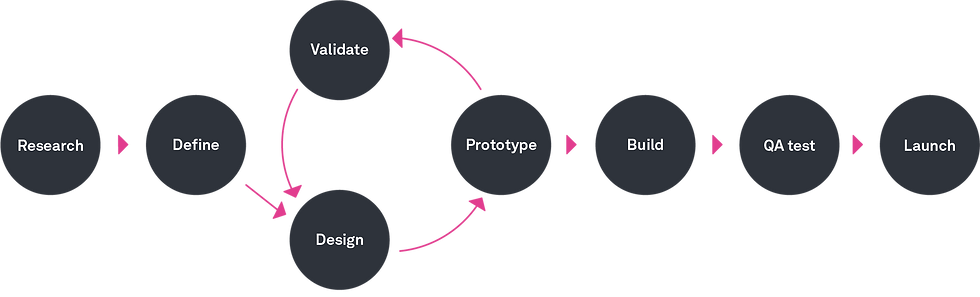
As the sole UX/UI Designer and Content Strategist, I led the redesign of Tammany Health’s e-commerce experience for a small business owner. The primary goal was value validation and I focused on user research and iterative design, improving trust, usability, and conversion rates for their website.
I executed a structured research, define, design, prototype, and validate process:
-
Research: Conducted user interviews, competitive analysis, and affinity mapping to uncover usability challenges and underlying feature prioritization.
-
Defined user personas, task flows, and information architecture to refine the user journey.
-
Designed and iterated on medium- and high-fidelity wireframes, validating changes through A/B testing and usability studies.
-
Developed a UI kit and redesigned the logo to establish a consistent, professional brand identity.
While building, QA testing, and launch were beyond the project’s scope and resources, I built a final prototype that addressed product discovery, checkout friction, and trust-building elements, which aligning both user needs and business goals while laying the groundwork for future development.
Research
Why Are Customers Hesitant?
✔️ Customers needed assurance.
Many users hesitate to buy due to an unprofessional site appearance and unclear product details, often seeking assurance from doctors, therapists, or trusted friends before making a purchase.
✔️ Product fit was a major concern.
Many customers struggled to determine which product best suited their needs due to unclear specifications, leading to cart abandonment or seeking more reliable assistance.
✔️ Checkout confusion led to drop-offs.
Unexpected costs, lengthy forms, and unclear return policies frustrated users, often causing them to abandon their purchases before completing checkout.
I conducted one-on-one interviews with potential customers to uncover pain points and motivations behind medical supply purchases. The participants included:
-
Caregivers & Family Members (Buying for elderly parents, post-surgery patients)
-
Athletes & Rehab Patients (Seeking braces, supports, and therapy equipment)
-
Older Adults (Managing chronic conditions, mobility aids)
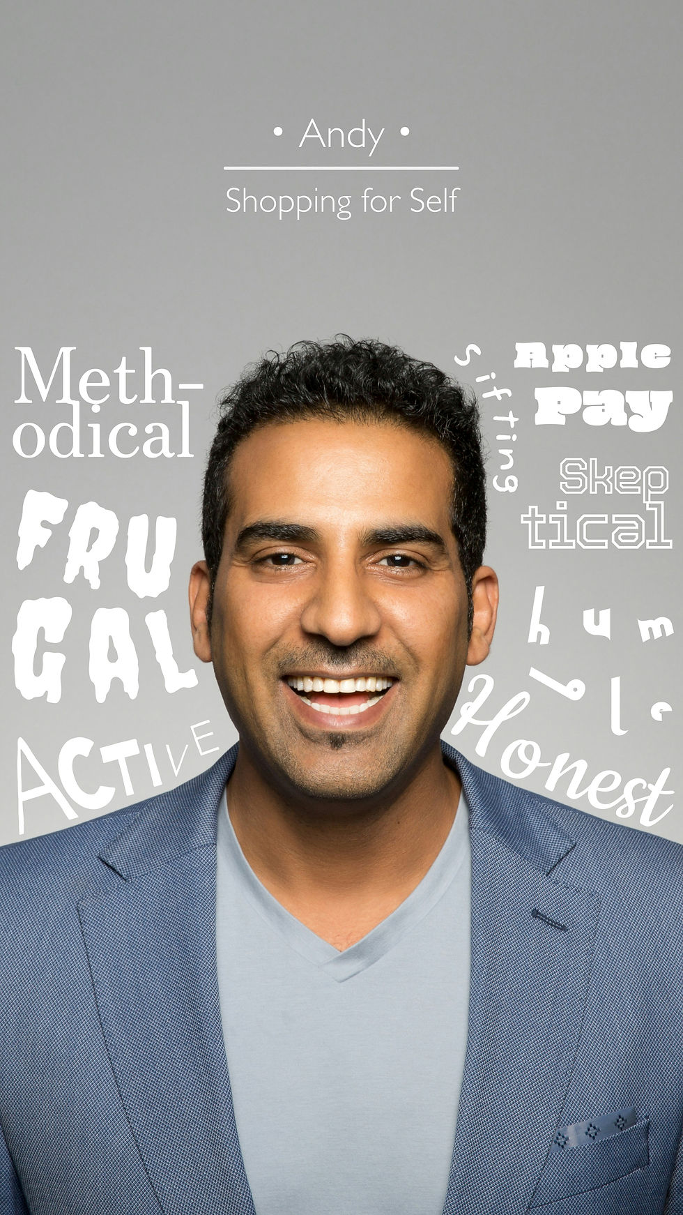
Cumulative Insights on User Values and Tactics
To visualize the behaviors studied in user interviews, I created a user persona poster representing the typical buyer’s journey, focusing on needs, frustrations, and decision-making patterns. To accomplish this, I used the affinity mapping method, featuring direct quotes and insights.
The primary persona was someone in need of medical equipment for temporary use, with varying levels of product knowledge.
Challenge & Refinement: Initially, affinity mapping revealed broad patterns that lacked specificity in insights for diverse users and purchasing needs. To address this, I focused on the intent behind user concerns and recurring key themes, which helped create a more accurate reflection of purchasing behaviors.
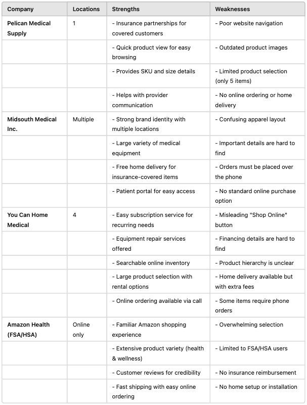
Competitive Analysis: Learning from Market Leaders and Other Health Niche Competitors
I analyzed e-commerce platforms for medical supplies (Walgreens, CVS, Amazon) and niche competitors (Better Living Now, Med Mart).
🔹Gains: Clear trust signals, easy product comparison, streamlined checkout.
🔹Areas of Loss: Outdated designs, overwhelming navigation, lack of user guidance -- just like Tammany Health’s original site.
Define
Define
.jpg)
.jpg)
Rapid Exploration: Structuring the Ideal Shopping Experience
Content Planning with Evidence-Based Features

Original Home Page
-
🔍 Issue: The home page lacks engaging content and clear CTAs.
-
Evidence: Images with minimal text and no product links.
-
Consequence: Users miss product pages, resulting in lost sales.
-
💡 Recommendation: Add featured products, banners, and clear CTAs to guide users to product categories.

Original Menu Dropdown
- 🔍 Issue: Lack of clear, distinct categories in the navigation.
- Evidence: Categories are not differentiated or organized.
- Consequence: Users struggle to find products, which increases bounce rates.
- 💡 Recommendation: Organize the menu with clear, distinct labels for easy navigation.

Original Product Category Page
-
🔍 Issue: Lack of filtering options on category pages.
-
Evidence: No filters for price, brand, or specifications.
-
Consequence: Users struggle to find products, leading to frustration.
-
💡 Recommendation: Add filtering and sorting options to improve product discovery.

Original Product Listing Pages
-
🔍 Issue: Listings lack essential info and visual appeal.
-
Evidence: Small images, minimal descriptions, no pricing info.
-
Consequence: Users aren’t enticed to explore, reducing engagement.
-
💡 Recommendation: Use larger images, concise descriptions, and visible pricing to boost engagement.

Original Product Details Page
-
🔍 Issue: Limited information and no persuasive elements.
-
Evidence: Basic descriptions, no reviews or product information.
-
Consequence: Lack of information reduces confidence, leading to abandoned carts.
-
💡 Recommendation: Add detailed descriptions, reviews, and product info to encourage purchase.
Develop
.jpg)
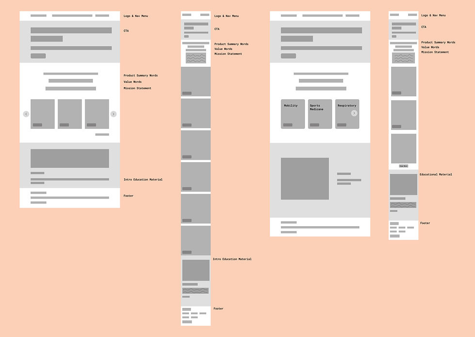
Rapid Wireframing: Home Page
For the home page, I focused on establishing a clear, user-friendly layout to direct users to the most important product categories. The wireframes experimented with various layouts for hero images, CTAs, and product categories to establish a welcoming structure. I also focused on mobile, supporting a condensed design for easy navigation.
.jpg)
Rapid Wireframing: Menu Dropdown
To reduce user confusion, I focused on organizing product categories with a clear hierarchy and testing different structures and placements for easy navigation. My low-fidelity wireframes explored both traditional dropdowns (a mega menu) and a search bar, recognizing that prioritizing simple category access could enhance the user experience.
.jpg)
Rapid Wireframing: Product Details Page and Checkout
I designed wireframes that reinforced a logical flow and key information on the product details page. This showcased essential elements like images, descriptions, pricing, and reviews to create a positive experience.
The goal was to reduce decision fatigue and build user confidence in making purchases. These wireframes laid the foundation for future work on the checkout flow and highlighted how simplifying product pages could directly impact conversion rates.
Develop
Usability Testing: Measuring the Impact of Changes & Iterating
Moving from low-fidelity wireframes to high-fidelity mockups, my focus shifted to validating key design decisions through usability testing and refining the interface based on user behavior.
While the wireframes established structure and flow, testing the high-fidelity mockups revealed new challenges in navigation, product discoverability, and checkout clarity. These insights led to targeted refinements:
Optimizing Search
Users instinctively relied on search, leading to a more prominent search bar and clearer category structure.
Selection Clarity
Unclear labels and product fit hesitation led to refined naming, improved visuals, and guided selection tools.
Checkout Certainty
Missing order details caused hesitation, prompting the addition of a cart review step to reinforce trust.
Mobile Interactions
Misclicks on key touchpoints led to expanded clickable areas and improved touch-friendly spacing.
Insights from Irth's Audience
Before Testing
High-fidelity mockups were polished, but usability testing revealed key pain points:
✔️ Users relied on search over navigation, making category buttons ineffective.
✔️ Product categorization was unclear, causing hesitation.
Insight: 2/5 users misclicked on size selection, accidentally selecting "Size" instead of "Add to Cart."
✔️ Checkout uncertainty led to hesitation when purchasing.
Insight: 1/5 users expected an order summary before checkout but couldn’t find one.
After Key Iterations
Key updates improved clarity, efficiency, and trust, significantly improving the user interface strength:
✅ Search bar placement improved, making product discovery faster.
✅ Category labels and visuals refined, reducing hesitation.
Action: To fix this roadblock, I improved interaction flow and considered a guided selection process for clarity.
✅ Checkout streamlined, increasing confidence in completing purchases. Action: A cart review step was added to provide clear order confirmation before finalizing purchases.
Final Iterations of High Fidelity Screens
Implementing Change into the Final User Experience


Refining the Visual Identity: Style Guide & Logo Redesign
I explored three logo concepts:
❌ Magnolia (Louisiana state flower) – Too complex and holistic for an eCommerce store.
❌ Home icon (home health supplies) – Looked too blocky, too identical to large brands (Lowe’s).
✅ Cart-based logo – Best fit for the shift to online sales.
Original site lacked consistency, I designed a scalable UI kit:
✔️ Professional color scheme (medical blue & neutral tones).
✔️ Readable, accessible typography.
✔️ Button, form, and component styles for smooth interactions.

Deliver
Next Steps and Future Considerations
If the founder had additional resources to execute this redesign, the next steps for TammanyHealth would focus on:
🚀 Integrating an inventory management system to sync stock levels in real time. The current inventory management does not offer an efficient way to insure for either the owner or consumers.
⭐ Adding personal customer reviews to build trust and confidence in products. While TammanyHealth provides a great in-person experience, its digital focus tends to be on advertising sales. Pushing reviews would create a clear return. This project taught me just how crucial brand voice and execution are.
💬 Introducing a guided shopping quiz or expert endorsements to help users quickly find the right product (health items often require advice and tailored insight!), paired with additional user testing to optimize product imagery and boost confidence in purchasing.
Final Impact:
✅ Easier navigation & faster product discovery
✅ Higher trust & reduced friction at checkout
✅ Stronger brand presence & scalable UI for future growth

The final prototype enhances the shopping experience for TammanyHealth by simplifying product discovery and the checkout process. By addressing key user concerns, it boosts confidence in purchasing decisions and sets a new standard for medical equipment e-commerce platforms, with users highlighting its ease of use and clarity in navigating complex product options.